When we read, we digest information. And as with a drink that accompanies a meal, the way text is presented can either allow the content to be washed down pleasantly, or leave a bad taste in the mouth.
That's why typography is important - it encompasses every element in the way our content looks on the page; from colour to fonts and size, and the layout. Reading shouldn't be a chore. It should attract a reader to a page, rather than deter them. Effective typography manages the text on a page effectively, using the right combination and contrasts of fonts, typesets and layout to draw a reader in, and keep them engaged.
In today's marketing-led business world, there is also a large branding element which must now be taken into account when considering typography. Sometimes this can make the process easier, arming a designer with a set of fonts and colours to use from within a set of brand guidelines - but occasionally the rules will need bending a little in order to suit the location of the content, and compliment any accompanying images.
Even in the absence of any preset corporate styling, it is still worth being aware of the brand identity that typography projects when used in company brochures, event invitations and advertising.
Of course, as with any element of design, even text, much of typography is down to preference. However, there are a few accepted golden rules which should be taken into account when considering how to make your page as impactful as possible. Here are some top tips to making sure your content is working for you, not against you:
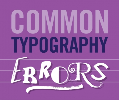
1. No school boy errors
Ensuring that content demonstrates consistency in spacing, as well as the bolding of relevant sections and capitalisation of appropriate passages, is one of the first boxes that should be ticked when it comes to ensuring that your typography is hitting the nail on the head. There are plenty more complex elements to think about, so make sure you get the basics right!
2. Kern I or Can't I?
Kerning is the name given to the sometimes subtle process of making sure your spacing is on the money when using typefaces with inconsistent lettering, which almost all possess to some degree. In the case of headlines or larger text, this may require some individual tweaking in order for it to look perfect.
3. Visual hierarchy
Depending on your destination - print or web - exceptional typography benefits from the careful structuring of a visual hierarchy. Taking a web page for example, this can mean larger bold headings placed in a left hand column, with smaller secondary headings being found on the right. Colouring should also take into account the 'order of importance' and be weighted accordingly in terms of boldness.
4. Don't go overboard
It isn't typically a good idea to use too many font faces, and common wisdom suggests you shouldn't exceed three. This will guard against confusing the reader, and remember even with two font faces there are still a range of different variations you can use to make words, sentences and passages distinctive.
If you have any typography questions - we'd love to hear them! Call us on 0117 216 5151
Welcome to Brand51 Insights where we share our thoughts and useful tips to help you improve your company branding...